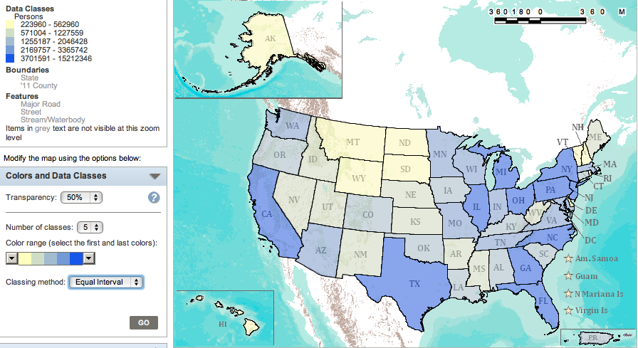
Hypothesis
I thought if I created a map that displayed the number of divorce rates in the last year amongst women, the percentage would be higher in more Northern states. We generally associate the North with more liberal ideas and the South with more conservative views. Some conservatives may base their ideas off of religious beliefs, in which many do not widely accept divorce.
To create my map, I first selected 'People' for the topic. Then I selected 'Marital and Fertility' from the drop down menu and selected the appropriate subcategory. Then, for the Geographies category I selected all states within the United states and then created my map.
To create my map, I first selected 'People' for the topic. Then I selected 'Marital and Fertility' from the drop down menu and selected the appropriate subcategory. Then, for the Geographies category I selected all states within the United states and then created my map.
Analysis:
My hypothesis was supported for the most part. There appeared to be the most number of divorces amongst women around the North East which is not surprising because they are generally considered to be fairly liberal. I was surprised, however, by the number of divorces in states like Texas, Florida, Georgia and North Carolina because I would think of them as more conservative states. The fact that California has such a high rate is not surprising because they are extremely liberal and very progressive.
Lying With Maps:
Chloropleth maps create a problem because depending on your scale and classing method, your data results could look completely different. Also, important details such as the population of a region are not taken into consideration. This is not so much of a problem in my map because no matter what classification method the data set is programmed to, it looks pretty much the same. The population aspect does throw it off a little because obviously a large state like Texas is going to have a much larger population than a state the size of New Jersey, yet they are the same color.
Map scale effects a readers perception of a map because it can either make your data appear to be more generalized or more specific. On a large scale map, where you are more zoomed into a specific area, the reader would be able to get a better sense of what parts of a population do or do not follow the data pattern or where there is a higher or lower percentage of whatever unit you are measuring.
American FactFinder could be used by public agencies and private corporations to promote different products, businesses, etc. Using this program, they could manipulate different data sets to display what they need to help market their product. It could also help them to decide where, to whom and how they need to advertise their product based on the information the map provides.
